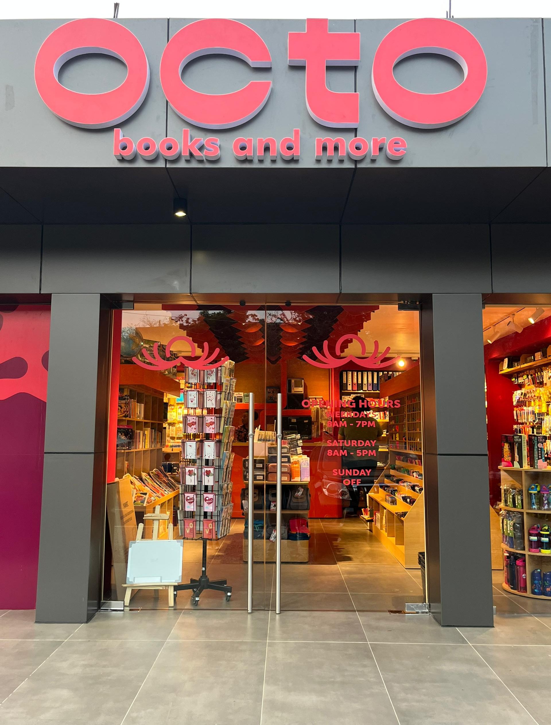
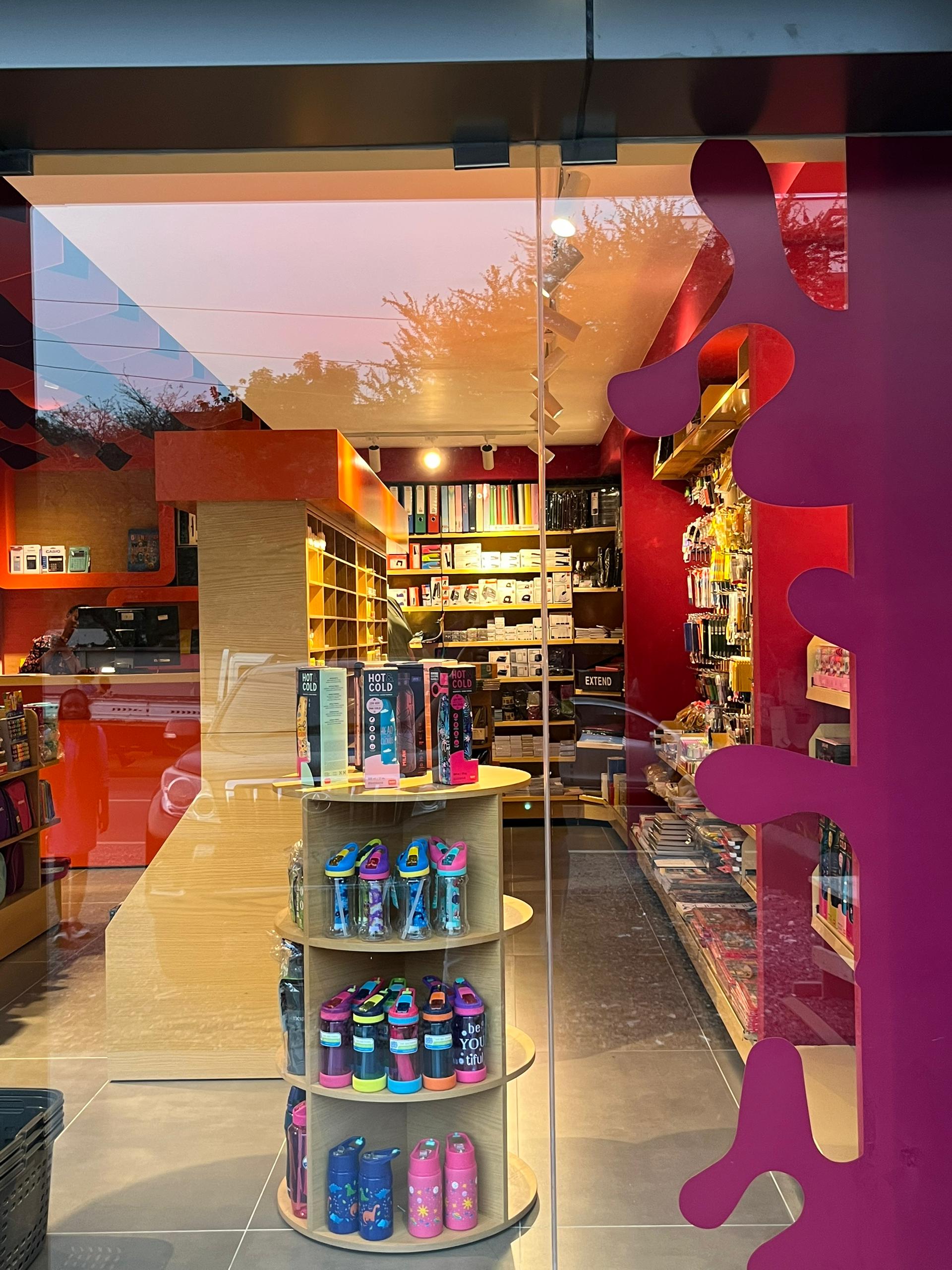
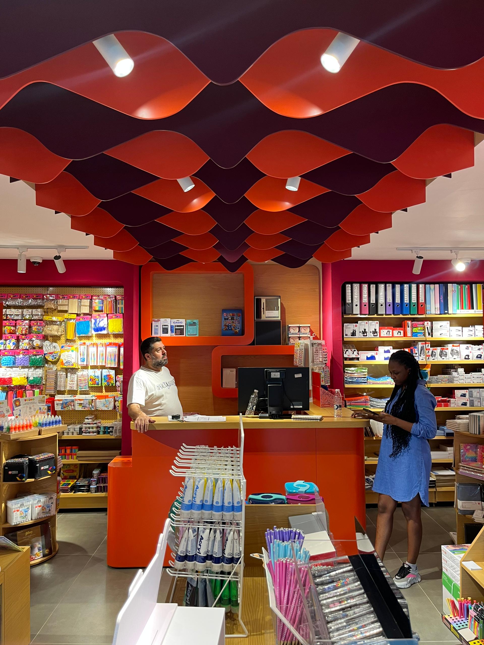
We developed the naming and full brand identity for Octo.
The name draws from the octopus, a symbol of curiosity and problem-solving.
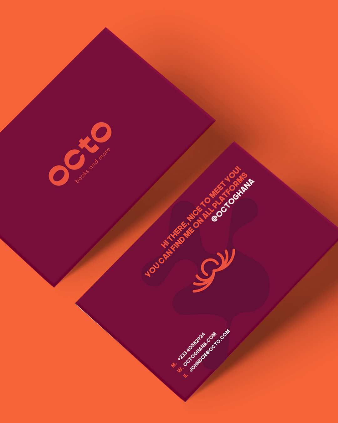
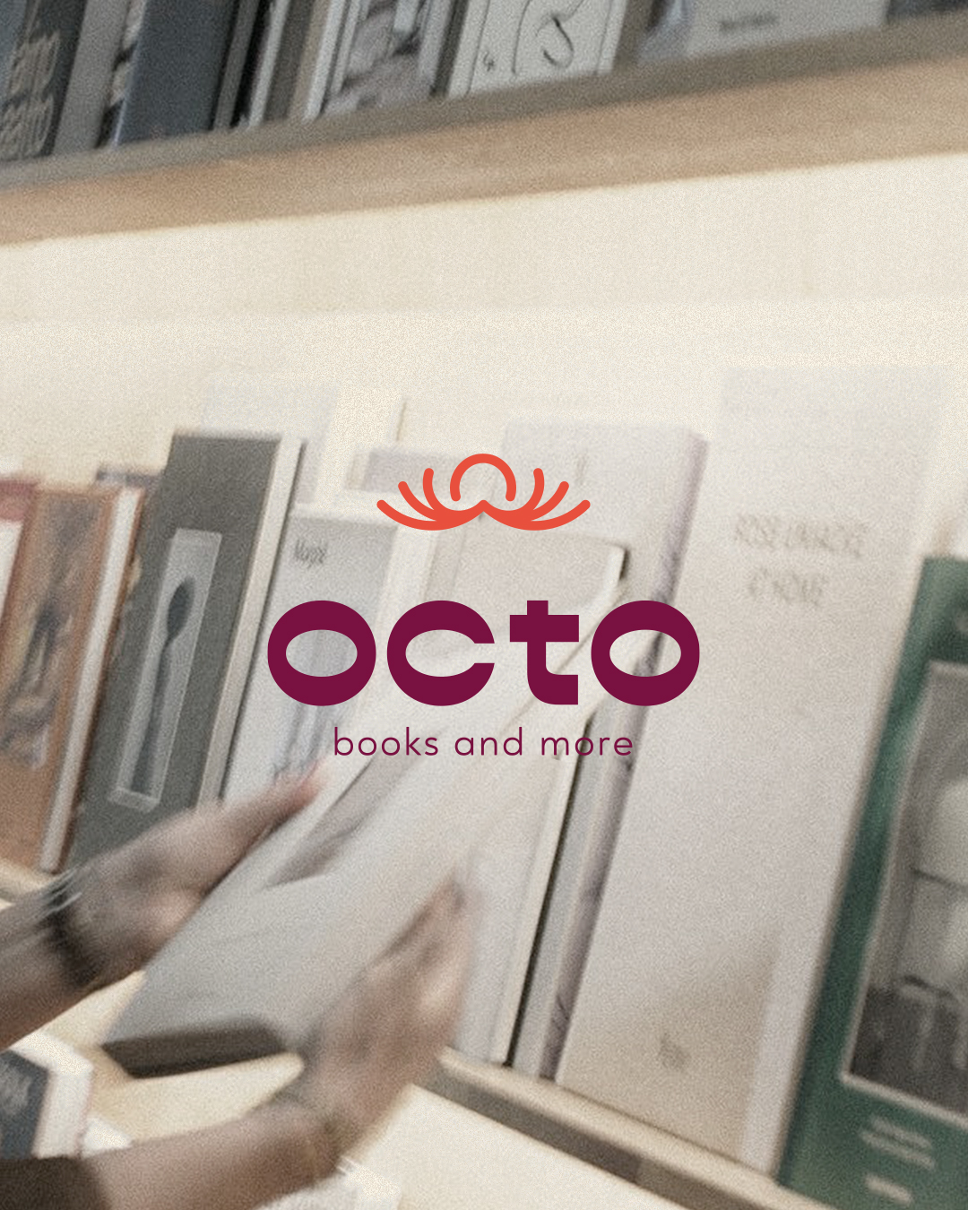
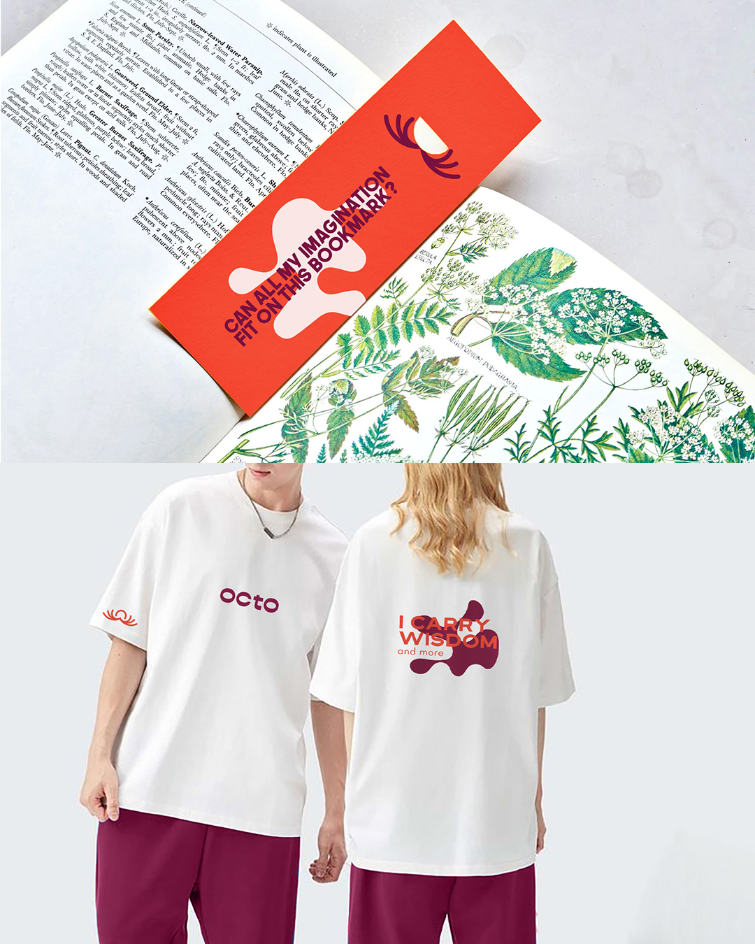
The emblem balances intelligence with fluidity, while the logotype remains minimal and modern, creating a clean and scalable system across touchpoints.
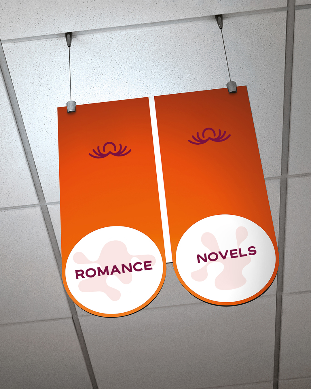
This idea carries into the visual identity, where tentacle forms merge with an open book, expressing knowledge, learning, and creative exploration.

The result positions Octo as a design-led destinationfor books, stationery, and creative tools,
with a distinctive and memorable brand presence.